Users – able to navigate around large scale, complex data sets as fast and easy as navigating around a web site. > Go to User Guide
Editors – able to edit the front end of a Hopara Viz App: add, remove, and re-position ‘assets’ on the screen like floor plans and data reporting units like sensors or IoT devices. > Go to Editor Guide
Developers – able to build new Hopara Viz App using a Pre-designed template connected to your data set.> Go to Developer Guide
If you would like a totally custom viz app please Contact Hopara Labsto discuss your data resources and business requirements.
3. Developer Guide: Learn how to get started building a Hopara data viz app.
This guide will teach you how customize a sample Hopara Viz App template. Later in a tutorial with Hopara Labs you will learn how to connect your data to create your own custom viz app from a template.
There are three steps to this Guide:
Basic App Navigation
Customizing an App Template using Sample Data
Creating a new app linking a Hopara Template to a NEW database
If you would like a viz app that does not look like one of the pre-designed Templates please Contact Hopara Labsto discuss your data resources and business requirements.
1. Basic App Navigation
Hopara viz apps are designed to make navigating around complex data fast and easy for any user. You DO NOT need any special skills or training. If you can use a mouse or touchpad you can navigate a Hopara Viz App.
For a detailed description of how to navigate around a Hopara Viz App please refer to the User Guide.
Building and navigating around a Hopara Viz App is like a 3D model. You will be building a series of Layers that viewers can drill into one Layer at a time, and then pan/zoom around from one side to the other. You may want to set Section A1 to be yellow and show data subset A, and then set Section A3 to green and show data subset B, vs Section H3 that will want to show as Red flashing showing data alerts based on thresholds you set.
Watch the quick sample vifdeo to the right. Note how the user zooms in, new data appears or disappears, click to reveal even more detail on demand, then zoom back out.
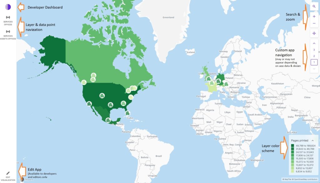
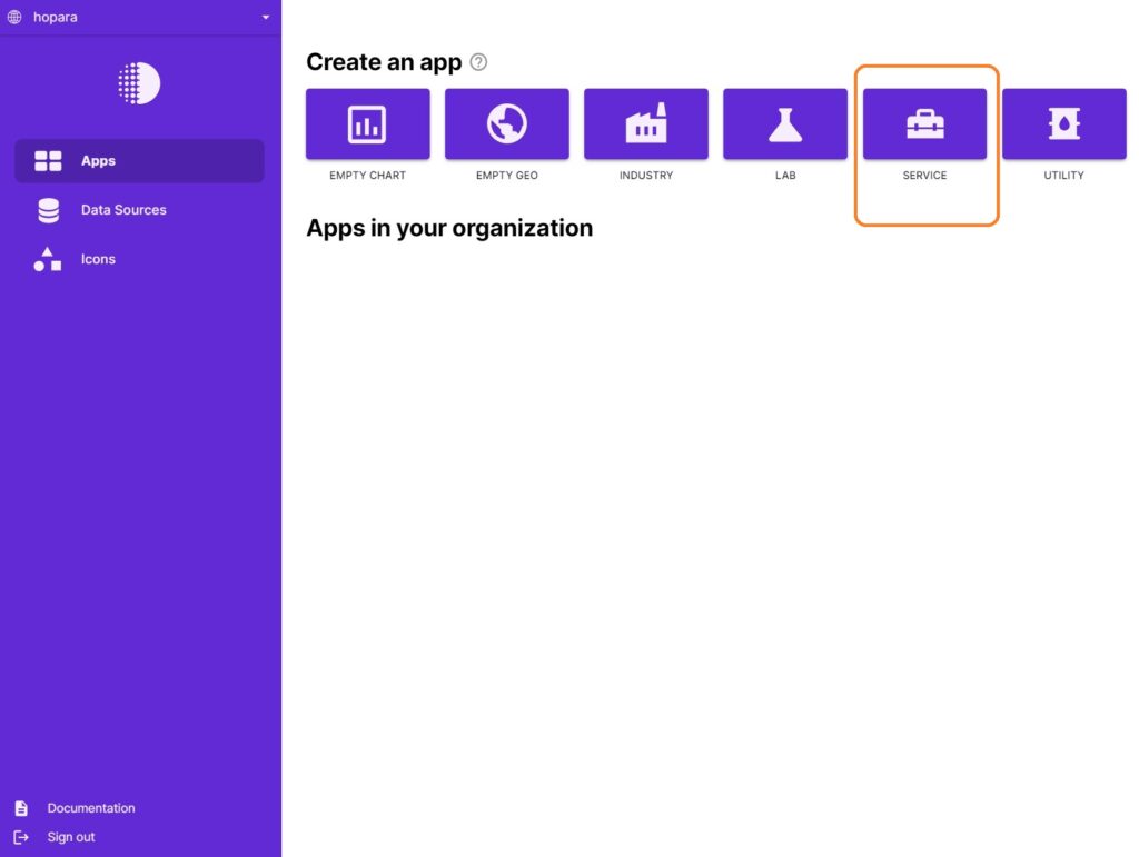
From the Home Screen and picured in Fig. 1 below, click on the Service icon and name it Test App I. A new window will appear like Fig 2 below. For this Guide you will be customizing an App that displays a connected network of printers (or any IoT connected device) in a global network of offices. In the bottom left of the menu click on‘Edit Visualization’.
Fig. 1 – Home Screen
Fig 2. App Customization View
Fig. 3
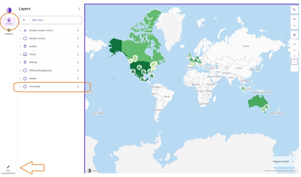
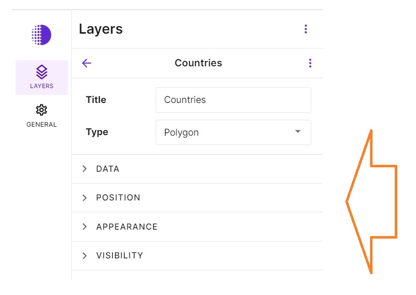
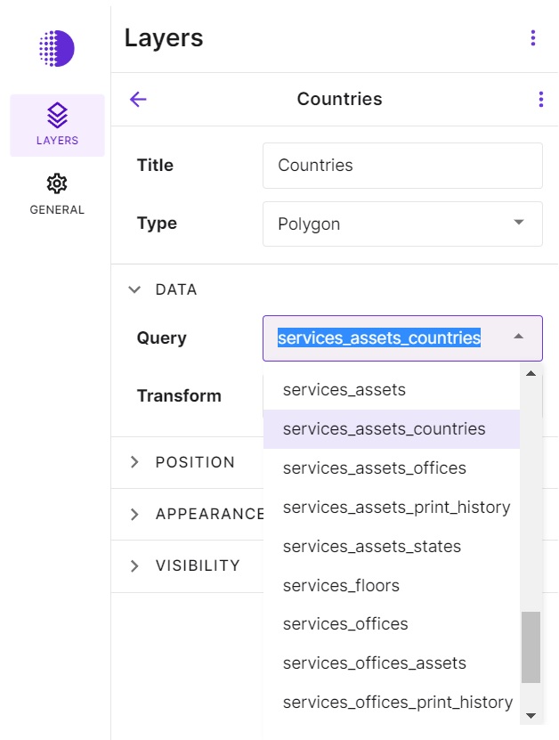
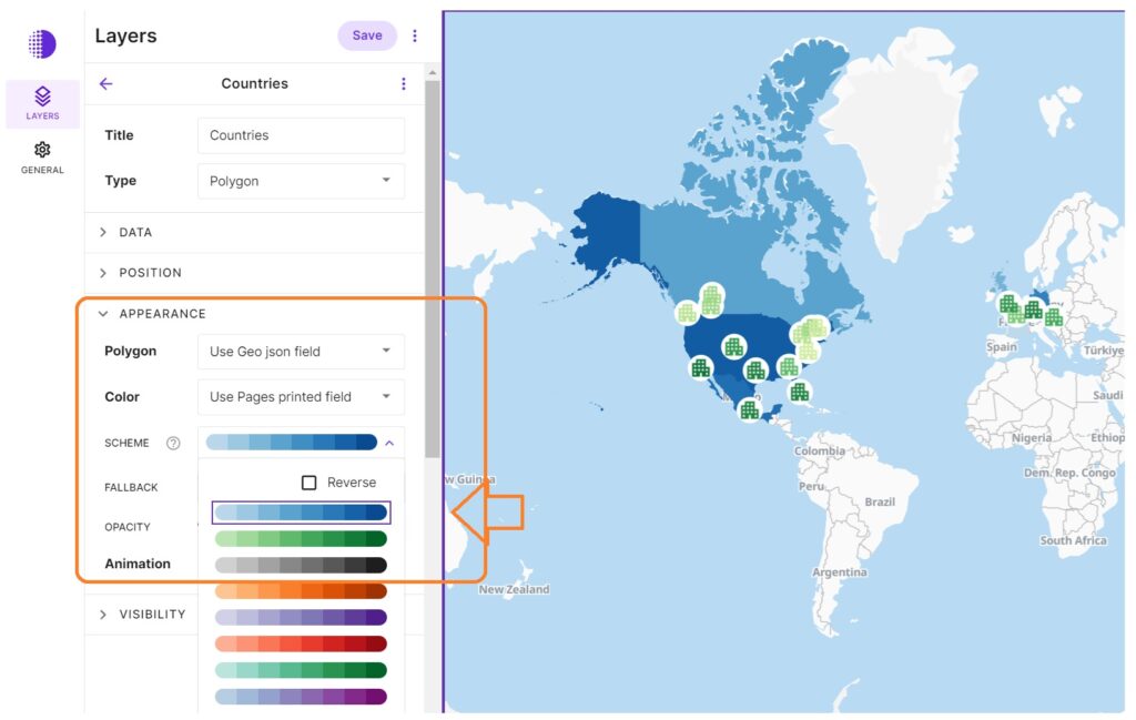
We’ll start by customizing Layers, starting with the Countries Layer.
Note the Layer options on the image on the right. Click on each one to open the sub-menu to familiarize yourself with each option.
Remember, you’re building a 3D series of Layers that will look and appear differently as users navigate through the App.
Fig 4.
For this Guide we will be using Sample data, and we have created the queries for you.
The Data tab is where you will link this Layer to a specific query that you will write later in this Guide. In this case we have chosen as a default the ‘services_assets_countries’ query.
For now DO NOT CHANGE the Data Query.
Fig 5.
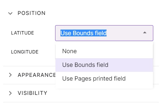
Now lets look at the Position tab. This is where you position the data for this Layer.
You have the option of None, Use Bound fields, or Use Pages printed fields.
Bound fields mean… HELP HERE PLEASE RICARDO
For now again please DO NOT change this setting, we’ll use Bound Fields.
Colors
Fig 6.
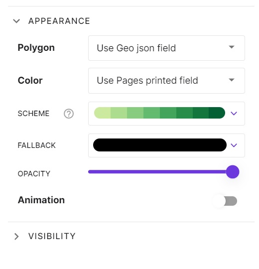
OK time to get customizing. Remember for this Guide we are building an App based on printers and number of print outs mapped on a world-wide network of offices.
Open the Appearance Tab until the drop down menu looks like the image on the right.
Polygon lets you customize the boundaries or areas where you’re going to present the data in this Layer. For example you could use the Geo json mapping from the database, or a list of countries with border which you have included in your data set. For now we’ll keep the setting as Geo json field.
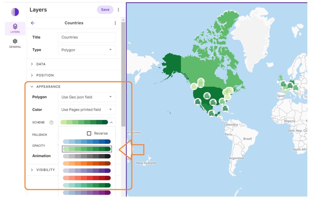
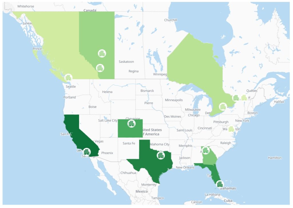
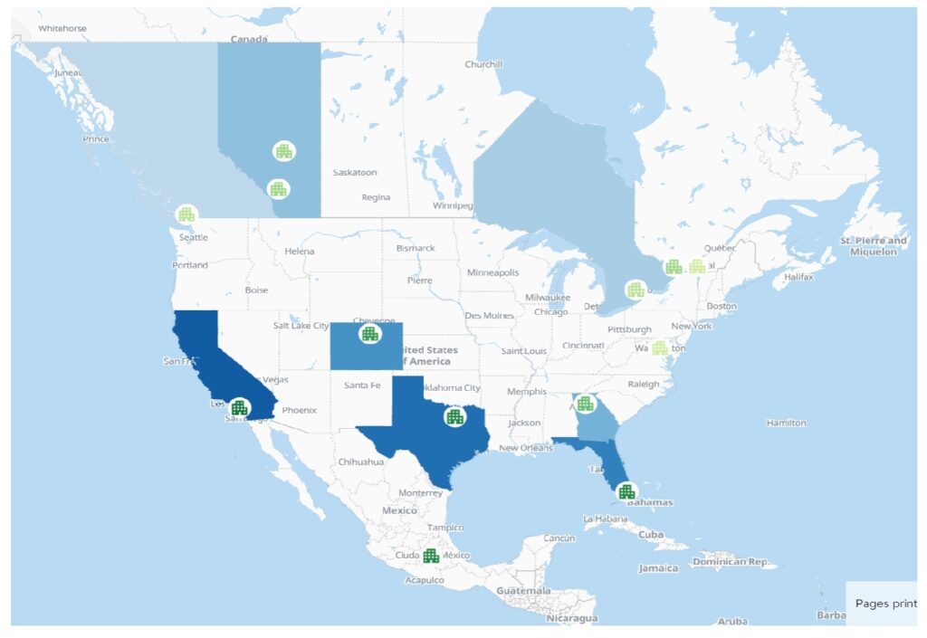
You can set the Color scheme for each Layer based on fixed color, or you can have the Colors change dynamialy as users navigate through the App based on the underlying data. In this case we are using a graded green color scheme based on the number of prints, by location. i.e. if you are at the countries level the total pages printed by all data reporting points that fall within that country’s area are rolled up into a certain shade of green. Try changing the Layer color from green to blue and seen in Fig. 7 & 8 below.
We’re not going to work with Animation for this Guide but its an option further ahead.
Fig 7 – Countries / Appearance / Color – Green
Fig 8 – Countries / Appearance / Color – Blue
Note in Fig 8 the Countries change to blue but the circles representing specific data reporting locations remain white and the building icons representing the various offices remain green. That’s because those Layers have not been edited yet.
You can also customize the Opacity of each Layer using the slider bar in the sub menu.
Save. In the top of the left side Menu click Save.
Fig 9.
Lets make your Sample App Color Scheme consistent throughout each Layer.
On the view on the right, zoom in until you see the United States with certain states colored green.
Fig 10.
Using the Purple Arrow to the left of ‘Countries’ go back to the list of all Layers and Select ‘States’.
Again keeping all other settings the same, change the Color to Blue and your view should look like the new image on the right. Again note that Circles are still white and the icons are still green.
Fig 11.
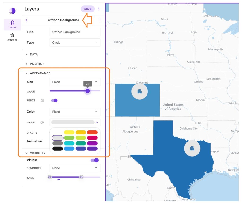
now using just the image on the right…
Change the Office Background to grey and increase the size to 75.
The following Layers should now be blue: Countries, States, Offices. And the Office Background (the circle around the office building icon) should be grey.
Try zooming in. Is that correct? Zoom out. How does that look?
Fig 12.
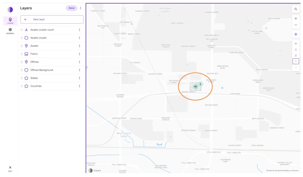
Now lets zoom all the way in to the detail of one office: Canada British Columbia.
Zoom back out until you can see all of North America, roll over the Office Background or Icon in the south west corner of Canada on the Pacific Ocean, roll over and click ‘Go to Location’.
Fig 13.
Use your mouse to the +/- navigation to zoom in until the whole office fills the view and the asset icons (in this case representing printers) are large on the floor plan.
Note the icons are green because you haven’t edited this Layer yet. Go ahead and try changing the icons to the same Blue so it looks like the image on the right:
Try increasing or decreasing the size.
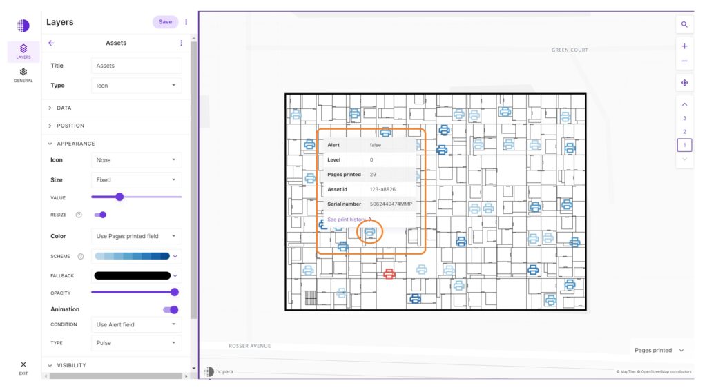
Next, click on any one if the icons until a new window pops up as show in the image on the right:
Its not part of this guide but so you can see the functionality click on ‘See print history’ – you can add this type of ‘Jump’ to a new view in your app later.
Dont forget to SAVE
Visibility
Fig 14.
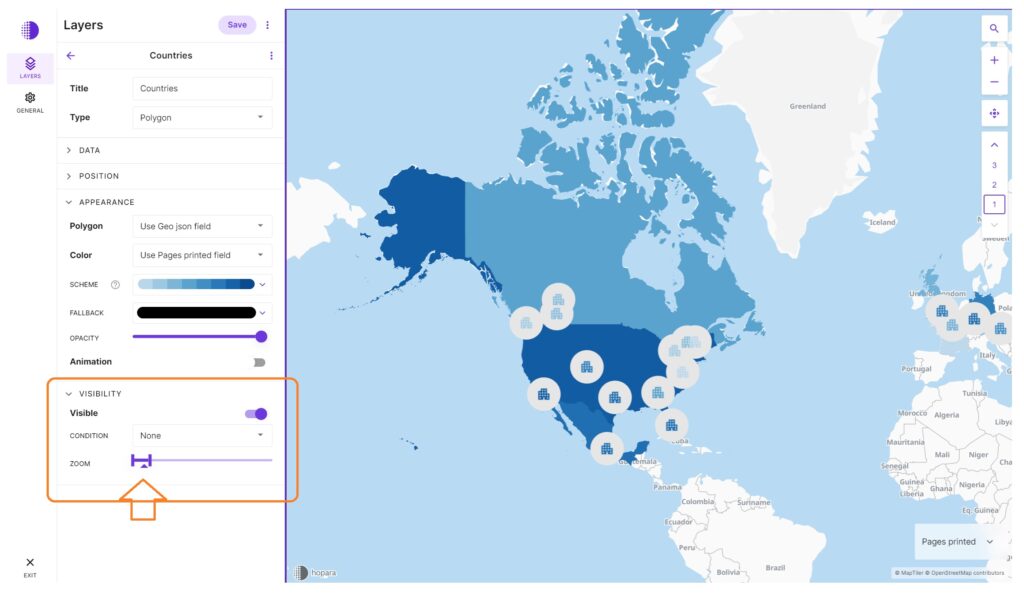
Lets move to editing Layer Visibility. Zoom all the way out until you see a global view like the image on the right. Note the small Triangle between two bold vertical bars. That shows you where you are in the view.
In the view screen, try zooming in until the Countries Layer goes away and the States Layer is visible. Note the triangle is now outside of the two vertical bars.
Without changing the zoom level, move the right hand vertical bar to the right until the triangle in back inside both vertical bars. Note the Countries settings re-appear. Move the right hand vertical bar back to the left until its back where it was.
Fig. 15.
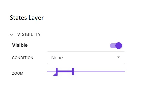
Now move to the States Layer. The Visibiltiy should be set as shown on the right. Again try zooming in until the triangle is outside of the two bars. Move the bars until its back inside.
Try playing around with various visibility settings in all of the layers until you get it just how you like it.
Editing Data Reporting Points & Images
Editing the location or view of a data report unit (icon or other) is first done through the database. You can customize each individal location in Editor mode. Please refer to the Editor’s Guide for detailed instructions.
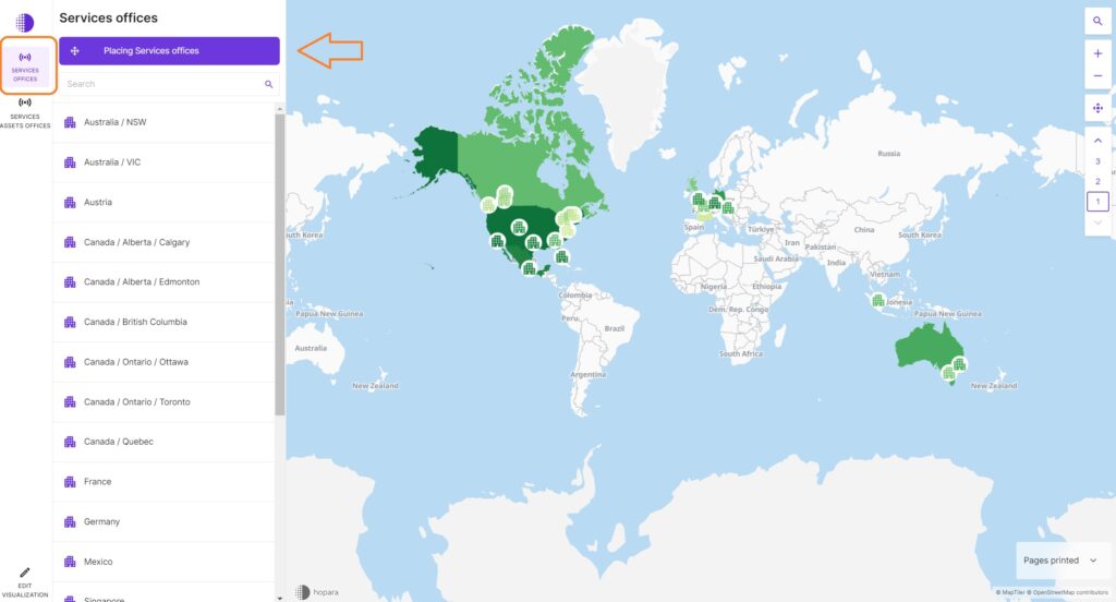
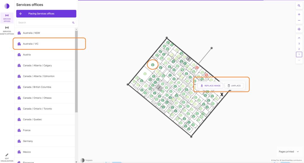
To edit data reporting points & images (such as floorplans, etc.), starting from the Home Screen, in the left side menu select the Services Offices option, then click on the Placing Services offices on the top of the expanded menu as in Fig 16 below. To move or unplace a data reporting icon, click and drag it to the desired location as shown in FIg 13 below; to replace an image click on an empty section of the image and select Replace Image and select a jpg or png file from your PC to upload; then move all icons until they are inside the new floorplan layout.
Fig 16.
Fig 17. Edit Assets detailed view
3. Creating a new app a Hopara template and your new data
Now you’re ready to create your first Hopara App using one of our pre-designed Templates and linking to a new data set. For this section Hopara Labs offers a free introctory tutorial for all Developers because we want your Apps to look awesome! PleaseContact Usto schedule a session.