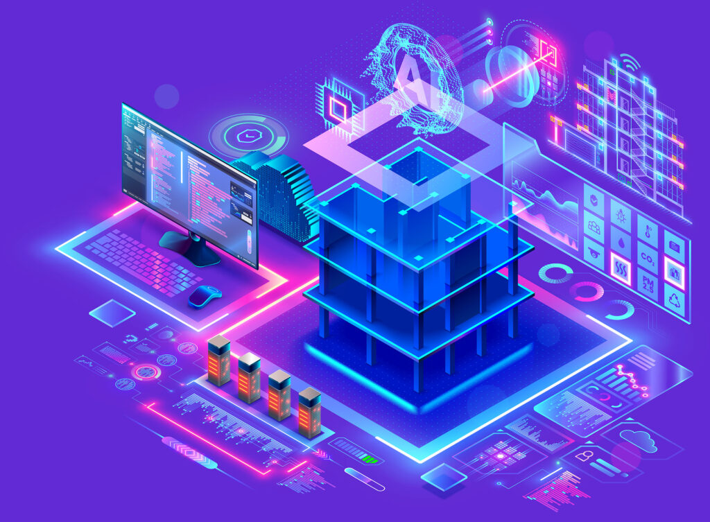
This User Guide will teach you how to navigate through, edit and customize, and then create a viz app using Hopara. In this introductory section we begin with login/setup instructions. Then Section 2 continues with navigation in Hopara.
To begin, in a secure web browser go to https://hopara.app. Use your work email to login to the Hopara web site. It will send you e-mail to confirm it is really you.
Next set your password and click Sign In.
You will receive an email verifying your login. Once your account has been verified you will be directed to a Home Screen similar to the image below. This screen shows a set of application templates available to you. Select Labs from the list and give a name to your specific application, say foobar. You should see a screen similar to the following which shows an example enterprise with three locations in the USA.
Figure 1: Initial Labs screen
You are now ready to start interacting with your application.
In this section we will explain the navigation controls on the right-hand side of the screen in Figure 1.
On your screen, you see a window onto the underlying data structure, which is an outline map of the world. Move your mouse to any given location, say Texas, and hold the mouse button down. Now move your mouse around. You should see the window move with you. Try moving to South America to get the display of Figure 2 and then back to the USA to Figure 1.
Figure 2: Window on South America
Move your mouse to the place you would like in the center of the screen (say Nebraska). Then, move your mouse over to the +/- control on the right-hand side of the screen. Click plus and you should see the screen of Figure 3. Another click yields the screen on Figure 4.
Figure 3: Zoom in on Figure 1
If you click (-) twice you will return to the screen of Figure 1. You can click + or – as many times as you want. You can readily see the finest granularity possible with succession of + gestures. Similarly, you can see the coarsest overview by a succession of – gestures. This detail on demand is a core feature of Hopara, and we will term this zoom/unzoom throughout this guide.
You can also zoom/unzoom by using the scroll feature of your mouse. Try this to familiarize yourself with the gestures.
Figure 4: Another zoom on Figure 1
Often you want to move to a specific location, say Cleveland, Ohio. Of course, it is fine to move to Ohio and then zoom in to see city locations and then move to Cleveland. However, Hopara offers you a rapid transit option. On the right-hand side of the screen you will see a magnifying glass icon. Click on it and type in Cleveland. Since there are multiple cities with this name, you will be prompted to disambiguate your search request. On selecting the correct Cleveland, Hopara will move/zoom to Cleveland, and you will see the display of Figure 5. This is a very fast way to get to a specific location.
Figure 5: Rapid Transit.
The final icon on the right-hand side of Figure 1 is a rotation icon. Click on it to enable rotation and then mouse around to rotate the display. Clicking on the rotation icon again freezes the display in the current orientation.
See if you can get something like Figure 6. Although this is not particularly useful for geographical displays, it is often valuable for floorplans or CAD displays that may not be correctly aligned.
Figure 6: Rotated version of Figure 1
The last concept in this section is your ability to get additional information by hovering over specific places on the display. Move to Arizona and hover over the red lab. You should see the display of Figure 7.
Figure 7: Hovering over the Red Lab
This will give you the information on why that lab is color coded red. Try hovering over the other two labs to see their details.
So far, we have focused on getting information from an existing Hopara application. In the next section we will move on to explore basic editing features in Hopara that will allow you to customize your displays.
In this section we show you basic Hopara concepts that will allow you to edit the Labs application which you created in the previous section. On the left-hand side of the screen are four icons. Click on the top one, and you will see the basic “home’ screen again as noted in Figure 8; however the foobar application has been created and an icon for this application appears on the screen.
Figure 8: An updated home screen
An important concept in Hopara is that all information presented on the screen comes out of a SQL database. Click on data sources and you will see the following screen
Figure 9: Data sources
Now click on the “Hopara” data source and you will see the screen of Figure 10. In that display are a collection of icons, each representing a query to a database.
Figure 10: The Data Sources
Click on Labs_Floorplans to see the query that retrieves the floorplans for the various labs in the database. Now click “run” to see the result of the query. You should see the display of Figure 11.
Figure 11: Floorplan data
Similarly click on the Labs_Assets icon to see that query. Then run it to see the data that is fetched.
The first table has a location field and an image, while the second has a room number and a description.
Now return to the home screen and zoom repeatedly near Labs 2 until you get the following display.
Figure 12: Zoomed in Labs 2
Notice that there is a floorplan and a collection of icons corresponding to assets, which have been retrieved using the queries that you saw above. Part of the design of a Hopara application is the database that is used for data storage and the queries to that database that populate displays.
The next concept you need to know is the notion of entities. An entity is a collection of fields in the database that can be rendered on the screen. Each entity has a location, and we have seen two entities already Labs and Assets. If you look on the left hand side of the home screen, you will see icons for each of these entities. Clicking on either icon will allow one to “move” the icon, if it is not in the correct location. This allows you to correct location errors in the data. Click on Labs_assets and pick an icon and move it to a different room. Now return to the data sources screen and run the Labs-assets query. You should see an updated tuple in the database. Note clearly that “ground truth” is in the database, and any update you make to an application will be immediately reflected in the underlying database.
Besides entities and data sources, there is one final concept that we need to introduce, layers. This is the concept that supports zoom/unzoom. At a high level, a layer can be thought of as a two-dimensional canvas onto which information is placed that results from a SQL query to the database. In turn we will talk about visibility, appearance, data, position, and other topics.
To begin, go back to the initial lab screen of Figure 1. Now hit (-) 4 times to go to the outermost display. Now hit (+) 22 times to zoom into the innermost display. There are a total of 22 zoom levels in the Labs application. In many of them the information displayed changes.
Now imagine a geographic analogy – in many geographic applications there is a concept of layers, for example county boundaries, roads, vegetation, rivers and streams, etc. Each of them is a separate display that can be turned off or on. In Hopara, such layers exist and are turned on and off automatically as the user zooms or unzooms. Return to the initial lab screen of Figure 1 and click on the “app studio” button at the bottom lefthand side of the screen. You should see the screen of Figure 13.
On the left-hand side of the screen are a total of 12 layers. Click on the “Labs” layer and then on the visibility tab. You will notice that the Labs icon is visible from zoom level zero to zoom level 13. Click on (+) a few times keeping one of the labs icon in the field of view. Eventually at level 14, the icon disappears and is replaced by an aggregation of sensors. Move to the cluster layer and continue to zoom. Your will see the cluster split into multiple subclusters and then split again. Now move to the Room layer and continue to zoom. You can see how the various layers become visible and then disappear to make a pleasing zoom/unzoom experience. You can adjust layer visibility at any time and then save your changes to the database to make them permanent.
A major part of any Hopara application is the design of the layers to support zoom/unzoom. Play around with the visibility of the various layers and see how the design changes. At any time, you can discard your changes and return to an unmodified application.
Now notice the other fields in Labs layer. Labs has a name and a type, indicating what kind of display object to use. “Icon” is the current type and the beaker representation is what is displayed. The large colored circle is in a different layer (Labs background) which you can edit by going to that layer. If you click on the down arrow in the icon field, you will see all the representations you can use for Labs information.
Now click on the appearance tab. The fields exposed allow you to customize the appearance of the beaker.
The icon field allows you to select the icon to be displayed. In this example, it’s fixed, which means it will be the same (i.e. a beaker) for all rows.
The second field allows you to control the size of the beaker. It is currently “fixed”, which means its size does not depend on data from the database. If you click on the down arrow, you will see the options. The other four options mean the size of the beaker is determined by data retrieved from the SQL query which defines this layer. The four options are the various retrieved query columns. Try switching “fixed” to some other option to see exactly what this means.
Return to the “fixed” option for color and try changing the value. You will see that you can control the color of the beaker. Play around with the opacity to see what it does. Now turn on the animation button and play around with the type of animation.
The condition button allows you to animate only specific objects on the screen. For example, you may want to animate only assets in alert state. Any boolean or numeric value from the query result can be used as the condition. For numeric values, any value different than 0 is considered  true.
The data tab allows you to assign a query to this layer. The query controls what data is on the screen in this layer. To alter the query that defines a layer, you need to be fluent in SQL. If you don’t know SQL then get a SQL guide to help you through the concepts. In this user guide, we will not dwell on SQL concepts.
At some point in the future, we will add a WYSIWYG SQL editor to help you with writing or altering SQL.
It’s also very useful to understand the schema of the underlying database. We would recommend that you use the editor for the database you are using. With that tool, query the schema of the various tables to understand the data that is available to you.
We will not be discussing the “cluster” tab in the data section, as that is an advanced topic.
The final tab in this section is “position”. In other words, where do we locate each of the three beakers. They need an X and a Y coordinate. Expand the position tab and you will see that you can determine X and Y separately, In this case both are set from a single “location” field in the database, which is of type geographic point. You can also set them separately if X and Y are stored in different database fields. The options are all the possible columns returned by the query.
Furthermore, you can apply an X offset and a Y offset, for example to show the name of the asset right below its icon representation. Play around with moving the X offset and the Y offset to see what these tabs actually do.
When displaying a database field on the screen, the question arises “What to do with a null value”. The fallback button allows a user to decide this question.
The range value will be used to create a scale between the database value and what’s appears on the screen.
Scale is a concept used frequently in Hopara when binding a query column to size, color or offset. Let’s say we want to encode salary from the database as an icon “$”. Furthermore, salary ranges between $10,000 to $100,000. We can set a size range from 5 to 10 pixels. Hopara will then assign 5 pixels to the lowet salary (i.e. $10,000) and 10 pixels to the uppermost salary (i.e. $100,000). Using this scale, intermediate values will be proportionally sized.
Figure 13: The Layers in the Labs Application
At any time you can add a new layer by clicking on the top tab in the layers screen. You can delete a layer at any time by clicking on the three vertical dots at the right-hand side of that tab. Lastly, if you know JSON, and would rather edit a JSON representation of a specific layer, you can click on the three vertical dots at the right-hand side of the specific layer. You can then click on advanced mode and get the JSON representation of that layer.
The entities button controls what’s displayed on the left side bar. In our current application, this is:
This tab allows you to set the background for the current application. In our application, it is a map of the world. On this tab are the various maps that can replace the one utilized.
This tab shows the various versions of this Hopara application. If you want to back up to a previous version of the application, this will do so. The purpose of a versioning system is to allow you to back up from “dead-end” application paths.
For any query that populates any layer in your Hopara application, it is crucial that you pay attention to performance. Since all canvases have X and Y axis, you have to make sure that proper indexing is in place to ensure good performance. Usually, there is a “location” field in every table that you want to retrieve which is two-dimensional geometric value, i.e. is an (x,y) value. You should make sure that there is a spatial index on this field; otherwise performance will be miserable.
Sometimes it’s useful to dynamically change the data based on the zoom level. One example is the radius clustering which aggregates objects in a configured pixel radius.
A transform takes the query result and the zoom level as input. The output will depend on the transform, but usually, it will remove categorical columns from the original query and add new aggregated columns which will be available to the layer configuration.