- Blog
7 Effective Methods of Qualitative Data Visualization

Numbers tell one story; words, feedback, and observations tell another. Qualitative data visualization bridges this gap by turning text-heavy insights into visual formats that reveal hidden patterns and drive faster decision-making.
Standard bar charts won’t work here. You need methods designed specifically for non-numerical data like customer comments, interview responses, or process observations. The right approach transforms messy qualitative datasets into clear visuals that teams can understand at a glance.
In this article, we show you seven proven techniques to visualize qualitative data as well as practical steps to implement each. These strategies work across many industries—from analyzing user feedback to mapping operational workflows.
Understanding Qualitative Data Visualization Fundamentals
Before jumping into specific visualization methods, you need to understand what makes qualitative data unique and why standard charts don’t work for this type of information. Getting this foundation right will help you choose the visualization approach that actually serves your data well.
What Makes Qualitative Data Different from Quantitative Data
Quantitative data comes ready-made for visualization. Sales numbers, temperature readings, and survey scores slot easily into spreadsheets. You can calculate averages, track trends, and build bar charts almost automatically.
Qualitative data works differently: It tells stories through words, observations, and categories. When customers say things like “the interface feels clunky” or “I love that new feature,” they’re sharing insights that numbers simply can’t express. This type of data reveals the reasoning behind behaviors, not just the raw facts or quantities.
The main difference comes down to interpretation. Quantitative data usually means one thing; for example, if you sold 100 units, that’s exactly what happened. Qualitative data needs human insight to pull out themes, spot patterns, and understand the full picture.
Core Principles of Visualizing Qualitative Data
Successful qualitative data visualization rests on three key principles.
First, keep the context intact. Numbers can stand on their own, but qualitative insights lose their power when you separate them from their original setting. Your visualization should maintain clear connections between individual pieces of data and the bigger story they tell.
Second, choose clarity over complexity every time. Visual design experts know that viewers should understand your main point right away without having to hunt through messy displays. Clean, focused visuals always win over fancy, complicated ones.
Third, match your visualization to your audience’s background. Technical teams might want detailed network diagrams, but executives need quick thematic overviews. Adjust your visualization’s complexity based on who’s looking at it and how much time they have.
Common Challenges in Qualitative Data Representation
The sheer amount of data creates your first big challenge. Customer feedback, interview notes, and open-ended survey responses can quickly pile up into huge text files. Standard analysis methods simply can’t handle thousands of comments or detailed responses effectively.
Subjectivity adds another layer of difficulty. Two different people analyzing the same dataset might pull out completely different themes. This inconsistency makes it hard to build reliable, repeatable visualizations that your team can actually use for making decisions.
Then there’s the issue of constantly changing content. Unlike fixed sales reports, qualitative data keeps growing as new feedback comes in. Your visualization approach needs to handle these updates smoothly without losing track of what happened before or forcing you to start from scratch each time.
Proven Methods for Visualizing Qualitative Data
Working with qualitative data can feel overwhelming when you’re staring at pages of text, interviews, or survey responses. The seven methods below will help you transform that information into clear visuals that reveal patterns and make decision-making much easier.
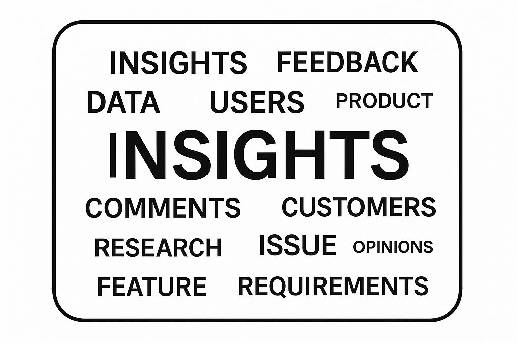
Word Clouds and Text Visualization Techniques
Word clouds offer a quick way to spot the most important themes in large amounts of text. The Data Visualisation Catalogue shows how these tools make word size match frequency, arranging them in clusters or shapes that catch the eye. When you’re analyzing customer feedback, being able to see the most mentioned terms instantly saves hours of manual review.
You can make word clouds even more useful by adding color coding for sentiment or theme categories, like showing positive feedback in green and concerns in red. Tools like Flourish and Wordcloud.pro give you control over these visual elements, so your qualitative data visualization matches exactly what you need to communicate.
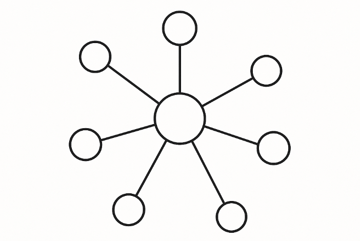
Network Diagrams and Relationship Mapping
Network diagrams shine when you need to show how different pieces of information connect. While analyzing interview responses or survey comments, these visuals reveal which themes appear together and how concepts relate to each other. Each circle (node) represents an idea, while the connecting lines show relationships or how often things appear together.
This method works especially well for mapping stakeholder relationships, process flows, or concept hierarchies. You can make important nodes larger and use different colors to represent categories or groups within your data, making the visualization of qualitative data much clearer.
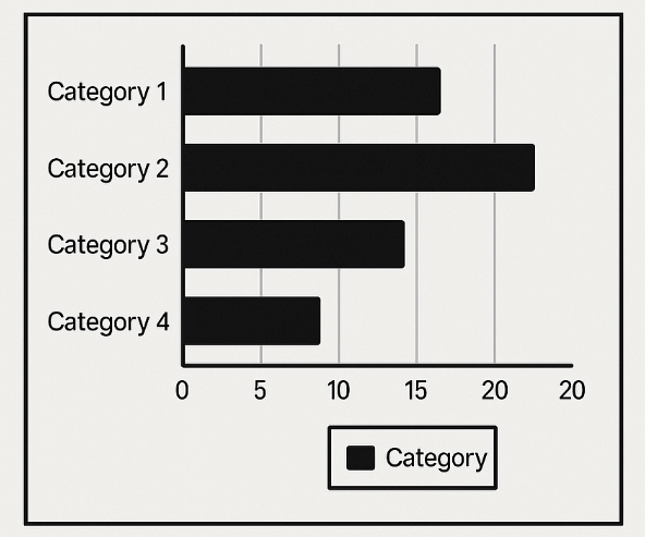
Thematic Charts and Category Breakdowns
Thematic charts help you organize information into clear categories, making it simple to compare volumes and spot dominant themes. Bar charts are popular here, but you’re not stuck with just showing frequencies. You can display sentiment scores, priority levels, or any other categorical breakdown that fits your data.
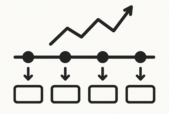
Timeline Visualizations for Process Data
Timeline visualizations work perfectly when your qualitative data includes time-based elements. Customer journey mapping, project retrospectives, and process documentation all benefit from chronological displays that show how events, feedback, or observations develop over time.
These visuals help you spot timing patterns, show cause-and-effect relationships, and highlight critical moments in processes. You can add layers of information like sentiment changes or stakeholder involvement at different time points, making your approach to visualizing qualitative data more detailed and useful.
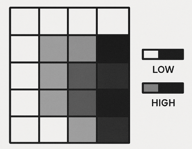
Heat Maps for Sentiment and Frequency Analysis
Heat maps turn your data into color-coded grids that make patterns jump out immediately. They work particularly well for showing sentiment analysis results across different categories, time periods, or demographic groups. Darker colors usually indicate higher intensity, frequency, or stronger sentiment.
Use heat maps to compare customer satisfaction across different product features, track sentiment changes over time, or identify which topics generate the strongest reactions in your data. This approach to how to visualize qualitative data makes complex patterns accessible at a glance.
Tree Maps for Hierarchical Qualitative Information
Tree maps display hierarchical data using nested rectangles, where each rectangle’s size represents something measurable like frequency or importance. This method works well for showing how sub-themes relate to main categories or how different aspects of feedback break down into smaller components.
The nested structure lets you see both big-picture patterns and detailed breakdowns at the same time. You can color-code different branches to represent additional dimensions like sentiment or priority levels, adding depth to your qualitative data visualization.
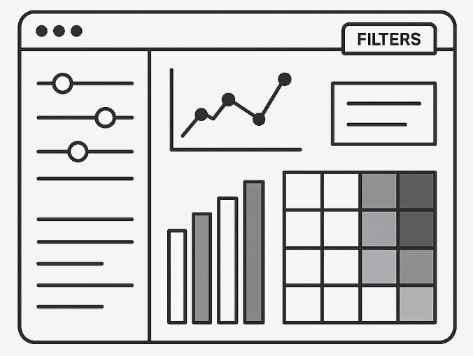
Interactive Dashboards for Multi-Dimensional Data
Interactive dashboards combine several visualization types to create complete views of complex datasets. Users can filter, drill down, and explore different aspects of the data without losing context. This approach works best when you need to serve different stakeholders who want to focus on specific aspects of the same dataset.
Comparison of Visualization Methods
Here’s a summary of these visualization methods to help you choose the right approach for your specific needs:
| Method | Best For | Data Type | Complexity Level |
|---|---|---|---|
| Word Clouds | Text frequency analysis | Large text volumes | Low |
| Network Diagrams | Relationship mapping | Connected concepts | Medium |
| Thematic Charts | Category comparisons | Categorical breakdowns | Low |
| Timeline Visualizations | Process analysis | Time-based data | Medium |
| Heat Maps | Pattern identification | Categorical with intensity | Medium |
| Tree Maps | Hierarchical breakdowns | Nested categories | Medium |
| Interactive Dashboards | Multi-stakeholder analysis | Complex, multi-dimensional | High |
Real-Time Data Visualization Platform for
IoTLife SciencesData LakesManufacturing
-

Interactive 3D Models
Add relevant context such as floor plans, technical drawings, and maps
-

Semantic Zoom Capability
Effortlessly navigate and drill-down between different levels of detail
-

Configurable Dashboards
Design visualizations exactly how you’d like to see them
How to Visualize Qualitative Data: A Step-by-Step Process
Creating effective qualitative data visualization requires a structured approach. You can’t simply throw text into a chart tool and expect meaningful results. Success comes from careful planning, thoughtful method selection, and rigorous testing of your final output.
Data Collection and Preparation Phase
Begin by organizing your raw data into a format that visualization tools can actually process. Customer feedback, interview transcripts, and survey responses typically arrive as messy text files, emails, or handwritten notes. Cleaning this up comes first.
Build a consistent structure for your data. Use spreadsheets or database tables with clear column headers like “Source,” “Date,” “Category,” and “Content.” Organizing data this way makes filtering, sorting, and analyzing much easier later on. When working with interview data, break longer responses into smaller, theme-focused segments while preserving the original context.
Remove duplicate entries and standardize terminology. When five different people mention “user interface problems,” “UI issues,” or “interface difficulties,” treat these as the same theme. Keeping things consistent prevents hours of extra work during analysis.
Choosing the Right Visualization Method
Match your visualization method to your specific data type and audience needs. Here’s the systematic approach that delivers results:
- Identify your data structure: Determine whether you have simple text, categorical data, time-based information, or relationship data.
- Define your audience: Technical teams can handle complex network diagrams, while executives prefer simple thematic charts.
- Consider your message: Choose word clouds for frequency analysis, heat maps for pattern identification, or timelines for process visualization.
- Test with sample data: Create a small version first to verify that the method works before processing your full dataset.
Following this structured approach ensures that you select the right method for visualizing qualitative data from the start, avoiding costly revisions later.
Design and Implementation Best Practices
Keep your design clean and focused. PolicyViz demonstrates how effective visualizations use color strategically—darker colors typically represent higher values, and consistent color schemes help viewers understand patterns quickly.
Choose colors that support your message rather than distract from it. Avoid using more than five different colors in a single visualization. When showing sentiment data, stick to intuitive color associations like green for positive and red for negative feedback.
Label everything clearly. Include legends, axis titles, and data sources. Your visualization should tell a complete story without requiring additional explanation from you.
Testing and Validation of Your Visualizations
Test your visualizations with actual users before presenting them to stakeholders. Show your charts to colleagues who weren’t involved in creating them. Can they understand the main message within ten seconds? If not, simplify your design.
Verify your data accuracy by cross-checking themes and categories. Have multiple team members review the same dataset to ensure that you’re not missing important patterns or misinterpreting the information.
Create multiple versions of the same visualization using different methods. Compare a word cloud version with a thematic chart version of your data to help you identify which approach communicates your findings most effectively when you need to visualize qualitative data.
Advanced Platforms for Qualitative Data Analysis
The difference between wrestling with clunky manual processes and smoothly converting complex datasets into clear, actionable insights often comes down to your tool selection. The most effective platforms combine intuitive interfaces with robust analytical capabilities, handling everything from basic text analysis to sophisticated multi-dimensional visualizations.
Key Features to Look for in Visualization Tools
Focus on platforms that offer multiple visualization types within a single workspace. You shouldn’t have to juggle separate tools for word clouds, network diagrams, and heat maps. The best solutions provide drag-and-drop functionality that lets you create different chart types from the same dataset, allowing you to experiment with various approaches without starting your analysis over each time.
Automated coding capabilities can save you countless hours when processing large volumes of text. Look for tools that identify themes, categorize responses, and extract sentiment automatically while still giving you the flexibility to make manual adjustments.
Real-time collaboration features become critical when multiple team members need to work with the same datasets. Platforms supporting simultaneous editing, commenting, and version control help you avoid the headaches of conflicting analyses and lost work that often derail team projects.
Integration Capabilities with Existing Systems
Your visualization platform should connect smoothly with your current data sources. API integrations with survey tools, CRM systems, and databases eliminate the time-consuming manual data transfers that eat up productive hours.
File format compatibility matters more than you might think. Your platform should handle CSV files, Excel spreadsheets, JSON data, and text documents without requiring format conversions. This flexibility becomes essential when dealing with data from multiple sources or when team members use different tools for data collection.
Understanding the differences between platform types helps you make the right choice for your specific needs. The table below shows how basic platforms, enterprise solutions, and AI-powered tools stack up across key features.
| Feature Category | Basic Platforms | Enterprise Solutions | AI-Powered Tools |
|---|---|---|---|
| Automated Coding | Limited keyword matching | Theme extraction with validation | Machine learning categorization |
| Data Source Integration | Manual file uploads | API connections to major platforms | Real-time data streaming |
| Collaboration Features | Basic sharing options | Team workspaces with permissions | Real-time co-editing and commenting |
Real-Time Processing and Dynamic Updates
The ability to process new data as it arrives turns static reports into living documents that reflect current conditions. Real-time processing becomes especially valuable for ongoing projects like customer feedback monitoring or market research, where insights need to stay fresh and relevant.
Hopara addresses these platform requirements through an intuitive interface designed for both technical and non-technical users. The platform handles diverse data sources through seamless integration capabilities, connecting with everything from IoT sensors to CRM systems. Real-time visualization updates ensure that your qualitative insights remain current as new data flows in, while customizable dashboards let different stakeholders focus on the information most relevant to their decisions. Whether you’re analyzing pharmaceutical research data or manufacturing feedback, it’s worth trying Hopara to experience how the right platform transforms qualitative data into clear, actionable insights.
Conclusion
Turning text-based feedback, interview notes, and observational data into visual insights demands the right mix of methods and tools. Success comes from aligning visualization techniques with your particular data type and audience requirements while following design principles that put clarity before complexity when you visualize qualitative data.
The platform you select determines whether qualitative data visualization becomes part of your regular workflow or stays a lengthy manual task. Look for solutions that connect with your current systems, handle data processing in real time, and enable collaboration among team members with different technical backgrounds. Begin with one visualization method using your existing datasets, then broaden your approach as you build experience with these techniques and spot new opportunities for analyzing text-based information.
Real-Time Data Visualization Platform for
IoTLife SciencesData LakesManufacturing
-
Interactive 3D Models
Add relevant context such as floor plans, technical drawings, and maps
-
Semantic Zoom Capability
Effortlessly navigate and drill-down between different levels of detail
-
Configurable Dashboards
Design visualizations exactly how you’d like to see them
FAQs
What’s the difference between qualitative and quantitative data visualization?
Quantitative data visualization uses numerical values in standard charts like bar graphs and line charts, while qualitative data visualization focuses on text-based information like customer feedback and interview responses that require specialized methods to reveal themes and patterns.
Can I use Excel or Google Sheets for qualitative data visualization?
While Excel and Google Sheets can create basic word frequency charts and category comparisons, they lack the advanced features—like automated theme detection and sentiment analysis—that specialized qualitative data visualization platforms provide.
How do I choose between a word cloud and a theme network for my data?
Use word clouds when you need to quickly identify the most frequently mentioned terms in your data. Choose theme networks when you want to understand how different concepts relate to each other and map complex relationships between topics.
What are some good ways to display qualitative data without losing important context?
Interactive filtering systems and sentiment dashboards preserve context by allowing users to drill down into specific categories, time periods, or themes while maintaining the rich detail that makes qualitative insights valuable for decision-making.
How long does it typically take to create effective qualitative data visualizations?
Simple visualizations like word clouds can be created in minutes, while complex theme networks and sentiment dashboards may take several hours to days depending on data volume and the level of customization required.
Want to learn more how Hopara can help you?
-

- Blog
Five Ways to Reduce Risks in Lab Operations
Precision. Data integrity. Quality. In competitive life sciences labs, these attributes directly impact research continuity, regulatory compliance,...
-

- Blog
Why Lab Environments Demand Innovative New Approaches
Pharmaceutical therapeutic discovery. Biofuel testing. Genomic breakthroughs advancing precision medicine. The unassuming work within life sciences laboratories...
-

- Blog
Unlocking Next-Gen Potential – Key Capabilities of Agile Digital Twins for Labs
While the digital twin concept shows immense promise for revolutionizing lab operations, traditional digital twin solutions come...