- Blog
Data Visualization Dashboard: A Guide to Modern Analytics
Data visualization dashboards give businesses powerful ways to understand and act on their expanding data sources. Research from McKinsey shows that organizations using advanced data analytics outperform competitors by 2.6x across key performance indicators.
Real time, interactive data visualization dashboards convert complex datasets into clear visual stories that provide you with actionable visibility which help drive better decisions, whether you’re tracking equipment sensors, clinical trials, or data lake. Real-time data visualization empowers you to unlock the potential of taking advantage of your data by providing immediate, actionable insights. The right dashboard solution helps teams spot trends, identify issues, and make faster, more informed choices.
This guide examines essential dashboard design principles, real-time visualization capabilities, and practical industry applications. You’ll learn how to evaluate and implement a modern data visualization dashboard software platform that matches your specific requirements. With the proper visualization tools and approach, your organization can turn raw data into meaningful insights that enhance performance and results.
Understanding Data Visualization Dashboards
Modern data visualization platforms help teams turn complex information into clear, actionable insights. These powerful software platforms combine visual elements to tell compelling data stories and support better decision-making.
The ones who support real-time 3D visualization transform complex data into immersive, interactive experiences, enabling faster decision-making and deeper insights through visual exploration.
Let’s examine how effective dashboards work and how you can use them to enhance your analysis capabilities.
Key Components of Effective Dashboards
Successful data visualization dashboards integrate several essential elements to present information clearly. According to IEEE findings, well-structured dashboards reduce information discovery time by 76%. The most effective designs prioritize visual hierarchy, thoughtful color selection, and balanced information density. This careful organization helps users quickly find and understand the data they need without feeling overwhelmed.

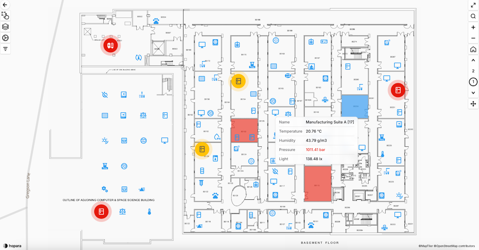
Example of a data visualization dashboard from Hopara Platform
Benefits of Interactive Visualizations
Interactive data visualization dashboard software adds depth to standard reporting by letting users explore data hands-on. Teams use drill downs , apply filters, examine specific details, and adjust their views to answer pressing questions. Manufacturing teams use these features to pinpoint quality issues within specific production runs, while research scientists can evaluate multiple variables at once to identify promising compounds. This level of interaction helps uncover valuable patterns that static reports might miss.
Types of Dashboard Analytics
Different analytical approaches serve specific business purposes:
- Descriptive analytics paint a picture of past performance through visual representations.
- Diagnostic tools help explain why certain events occurred.
- Predictive dashboards use advanced modeling to forecast future trends.
- Prescriptive analytics go further by recommending specific actions.
Each approach requires appropriate visualization methods, ranging from simple trend lines to sophisticated heat maps for complex data sets.
Your choice of analytics should align with specific objectives. Real-time, interactive data visualization dashboards take advantage of live and ever changing data to help understand current operations, while strategic planning benefits from tools focused on long-term patterns and predictions. Many organizations start with basic monitoring tools and gradually introduce more advanced features as their needs grow. Success comes from matching dashboard capabilities to concrete business goals rather than implementing unnecessary complexity.
Real-Time Data Visualization Platform for
IoTLife SciencesData LakesManufacturing
-
Interactive 3D Models
Add relevant context such as floor plans, technical drawings, and maps
-
Semantic Zoom Capability
Effortlessly navigate and drill-down between different levels of detail
-
Configurable Dashboards
Design visualizations exactly how you’d like to see them
Real-Time Data Visualization Capabilities
Organizations gain significant advantages through real-time data visualization when tracking and responding to continuous information flows. Teams can make immediate decisions using current data rather than relying on static and outdated reports, leading to substantial improvements in operational efficiency.
Streaming Data Integration
Advanced visualization platforms excel at processing multiple data streams simultaneously. Research from MIT Technology Review indicates that companies implementing real-time data analysis reduce operating expenses by 25% through better resource management. Production facilities utilize sensor readings to observe machine status, while research labs track environmental measurements for sensitive tests. These software platforms process incoming data continuously, ensuring that visualizations reflect the latest information.
Performance Monitoring Features
Successful monitoring extends beyond simple data display. Modern visualization software incorporates threshold detection, pattern recognition, and benchmarking capabilities. Team members establish specific operational parameters and receive immediate notifications when readings exceed designated limits. This functionality becomes essential in regulated settings where strict adherence to quality standards requires constant oversight.

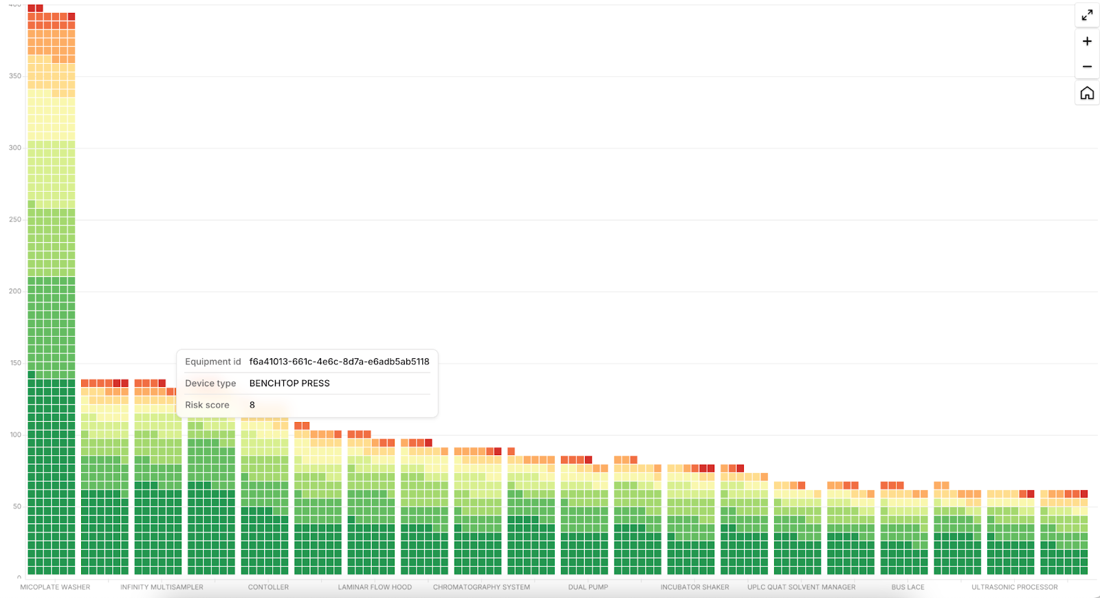
Example of a data visualization dashboard with real-time insights from Hopara Platform
Alert Management Systems
Intelligent alert mechanisms maximize the effectiveness of real-time monitoring through strategic notification management. Rather than sending updates for every change, these systems employ sophisticated filters to identify meaningful patterns. Industrial sensors may generate extensive data streams, but notifications trigger only for significant events. The International Journal of Medical Informatics notes that this targeted approach prevents alert fatigue, so critical warnings receive proper attention while reducing unnecessary interruptions.
Advanced Dashboard Design Principles
Building effective data visualization dashboards demands thoughtful consideration of design elements that make data clear and meaningful. The right design choices transform complex information into accessible insights that resonate with every user.
User Experience Optimization
Research from the Nielsen Norman Group reveals that users typically scan information on a screen in an F-shaped pattern. This refers to the way readers’ eyes naturally move when skimming content: starting at the top left, scanning horizontally across the first line, then moving down slightly and scanning across a shorter line, and finally vertically down the left side of the screen. This behavior emphasizes the importance of placing critical data points in the upper-left section and arranging supporting information in logical, visually accessible positions.
Strategic placement ensures users quickly locate the most important metrics, improving the dashboard’s overall effectiveness. Thoughtful color selection strengthens the user experience: Consistent color schemes enable quick recognition of related data while maintaining visual balance.
Data Storytelling Techniques
Strong data storytelling presents information through a logical sequence that users can easily follow. The process starts with establishing context, moves through key discoveries, and finishes with specific action steps. Take pharmaceutical research as an example: Scientists might start with broad trial outcomes, progress to notable patterns, and finish with targeted suggestions. This structured approach helps users grasp and remember complex relationships among different data points.
Customization Options
Data visualization dashboard software must serve diverse user needs effectively. Manufacturing floor leads might prioritize real-time production stats, while quality teams need detailed historical analysis.
Modern interactive data visualization dashboard platforms include features that allow each user to tailor their view to match specific requirements. This includes mobile-friendly designs that ensure smooth operation across all devices. Users retain control over chart selections, time periods, and data detail levels while preserving essential dashboard functions.
Hopara’s Innovative Dashboard Solutions
Concrete examples of dashboard implementations demonstrate how modern visualization tools solve specific business challenges. Hopara’s platform delivers configurable solutions that address unique industry requirements through specialized data visualization dashboard features.
Industry-Specific Applications
Manufacturing facilities use Hopara’s real time, interactive data visualization dashboard software platform to track production lines and quality measurements. The software captures equipment sensor readings to generate real-time displays of machine status, allowing maintenance staff to identify and fix issues before failures occur. Research teams in pharmaceutical labs rely on specialized dashboards to monitor test conditions and experimental outcomes, maintaining regulatory compliance while speeding up their research progress. These targeted applications showcase Hopara’s expertise in meeting specific operational needs across different industries.
Transformative 3D Visualization Capabilities
Hopara’s capabilities extend to unique 3D data visualization, enabling users to interact with data in dynamic and immersive ways. This feature empowers users to make faster, more informed decisions by leveraging an entirely new perspective on their data. For industries such as manufacturing, 3D visualizations provide clear, real-time views of production lines and equipment layouts, making it easier to pinpoint issues and optimize workflows. Similarly, pharmaceutical researchers can explore experimental data in a multidimensional space, uncovering patterns that traditional dashboards might miss.
Integration Capabilities
The data visualization dashboard software integrates smoothly with current databases and business systems. It extracts information automatically from connected devices, storage systems, and enterprise applications to build consolidated visual interfaces. Teams can view combined data from their CRM tools, ERP systems, and equipment monitors in a single, unified display. This streamlined approach removes manual data collection steps, enabling analysts to concentrate on extracting valuable insights.
Advanced Analytics Features
Hopara’s real-time data visualization dashboard provides robust analytical tools that convert raw data into meaningful business intelligence. Built-in predictive models help technical teams spot potential equipment problems early. Quality control specialists utilize advanced pattern detection to identify subtle manufacturing process variations.
These sophisticated capabilities come wrapped in a user-friendly interface that makes complex data analysis accessible regardless of technical background. Ready to explore how these capabilities can enhance your operations? Contact us to discuss your specific requirements.
Conclusion: Maximizing Dashboard Effectiveness
Real time, interactive data visualization dashboards have fundamentally reshaped how companies extract value from their assets. Real-time monitoring capabilities paired with advanced analytics allow teams to identify trends and respond to issues faster than previously possible.
Hopara differentiates itself through an interface that combines simplicity with robust functionality, enabling users across different roles to derive meaningful insights efficiently. Technicians, analysts, and managers can all benefit from the platform’s streaming data processing, personalized viewing options, and smooth integration with current tech infrastructure.
Organizations implementing data visualization dashboard software consistently report enhanced productivity and smarter decision-making processes across departments—from production floors to research labs. Teams using these tools gain clear advantages in spotting patterns, tracking key metrics, and sharing critical information.
Contact us to learn how Hopara’s visualization tools can boost your team’s analytical power and deliver concrete improvements to your operations.
Real-Time Data Visualization Platform for
IoTLife SciencesData LakesManufacturing
-
Interactive 3D Models
Add relevant context such as floor plans, technical drawings, and maps
-
Semantic Zoom Capability
Effortlessly navigate and drill-down between different levels of detail
-
Configurable Dashboards
Design visualizations exactly how you’d like to see them
FAQs
How can I ensure that my data visualization dashboard delivers meaningful insights?
Creating a useful data visualization dashboard starts with setting specific goals and understanding what users need. Start by selecting the essential metrics your team uses most frequently, then group them in ways that make sense with suitable visualization types. Add meaningful comparisons and reference points to give proper perspective. Make sure users can easily move between different information levels. Getting constant input from your team members lets you adjust and improve both the design and information displayed.
What security measures should I consider when implementing a data visualization dashboard?
Strong security for data visualization dashboards requires several protective components. Set up access levels based on user roles to limit who sees sensitive data, use secure encrypted data connections, and keep detailed records of who accesses the system. Put strong user verification steps in place and stay current with security patches. These steps protect your data while making sure authorized team members can access what they need.
How often should I update my data visualization dashboard design?
Plan to examine and update your data visualization dashboard every three months. Check how people use different features, ask for suggestions, and make sure your current charts still match what your business needs. Look for new tools and display methods that might help people understand the data better. These regular improvements keep your dashboard useful and running smoothly.
What’s the ideal number of metrics to include in a data visualization dashboard?
Most effective data visualization dashboards show 5 to 15 main measurements on each screen. This number gives users enough information without becoming overwhelming. Pick measurements that connect directly to your business goals and put them in order of importance, with the most crucial numbers in easy-to-spot locations.
How can I measure the ROI of my data visualization dashboard implementation?
Track specific results to determine your data visualization dashboard’s value. Look at metrics like reduced time spent analyzing data, fewer mistakes in reports, faster decision-making, and increased dashboard usage among team members. Compare these benefits to what you spent on setup and maintenance. Keep track of specific cases where insights from your dashboard helped save money or improve business results.
Want to learn more how Hopara can help you?


